Review
- 2024-08-24 08:15
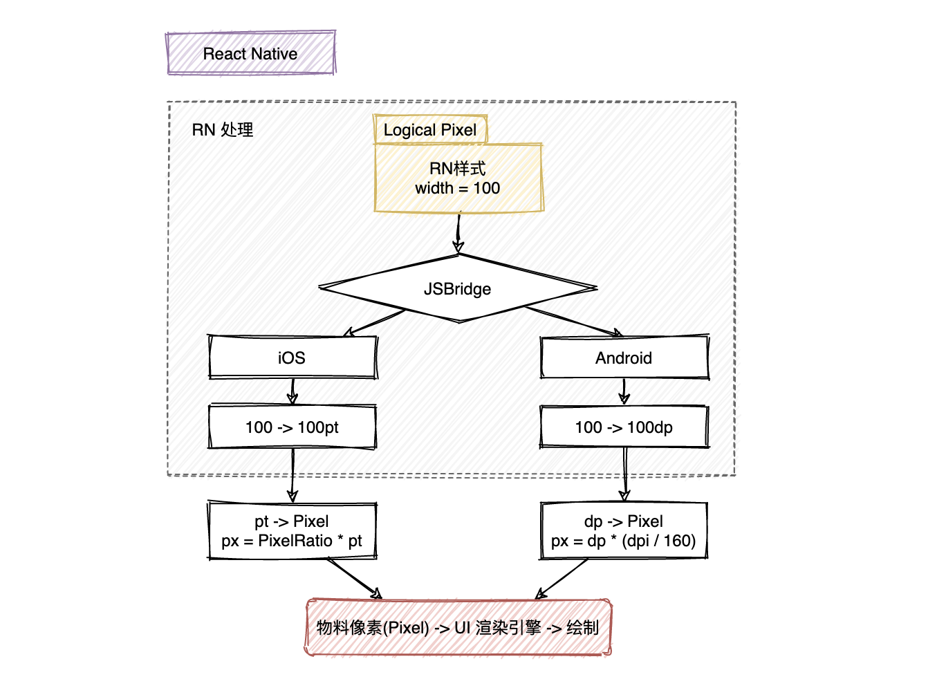
[!Summary] React Native 中的尺寸都是==无单位==的,表示的是与设备像素密度无关的==逻辑像素点==(logical pixels)。 React Native’s default unit is density-independent pixels (dp) while the web’s default is pixels (px).
一、Introduction #
React Native 中的尺寸都是==无单位==的,表示的是与设备像素密度无关的==逻辑像素点==(logical pixels)。
- iOS逻辑像素:pt (point)
1pt = 1/163 inch - Android逻辑像素:dp/dip (Density-independent Pixels)
1dp = 1/160 inch
RN Units
- number
- percentage(百分比)
常用组合工具
- Dimensions
- PixelRatio
const {
  height,
  width
} = Dimensions.get('window');- window: Size of the visible Application window.
- screen: Size of the device’s screen.
For Android the
windowdimension will exclude the size used by thestatus bar(if not translucent) andbottom navigation bar
SafeArea https://github.com/th3rdwave/react-native-safe-area-context A flexible way to handle safe area, also works on Android and Web!
术语(Terms) #
- 物理尺寸:Inch英寸,
1 Inch = 2.54 centimeters屏幕对角线长度。这个“物理尺寸”存在混淆,尽可能使用屏幕尺寸指代对角线长度,使用设备尺寸指代物理设备的尺寸,包括边框。 - 物理像素(Pixel):屏幕上最小的显示单元,物理像素越多,屏幕分辨率越高,显示效果越细腻
- 像素密度(PPI, Pixels Per Inch):每英寸上的像素数,像素密度越高,显示效果越清晰
- 设备分辨率(Resolution):The total number of physical pixels on a screen.
width pixel * height pixel - 屏幕尺寸:屏幕的对角线长度,单位Inch,屏幕尺寸越大,可以显示的内容越多。
- 操作系统:不同的操作系统有不同的缩放比例和字体渲染方式
- 应用设置:用户可以自定义应用的字体大小、缩放比例等设置
- CSS/布局引擎: CSS样式、布局引擎的计算方式都会影响最终的显示效果。
- dp (密度独立像素) 和 dip (设备独立像素) 实际上是同一个概念,只是不同的缩写
- sp (Scale-Independent Pixel) the same as dp but for Fonts
- pt (Points)
1/72of an inch based on the physical size of the screen.
设备屏幕密度DPI #
- DPI (Dots Per Inch) 每英寸点数,最初用于描述打印分辨率,Android开发中DPI用于定义屏幕密度。iOS不直接使用DPI,而是使用
scale factor如 @2x, @3x - PPI (Pixels Per Inch) 每英寸像素数,更准确的描述数字屏幕
在讨论数字屏幕时,DPI 和 PPI 常被互换使用,严格来说,对于屏幕,PPI 是更准确的术语。Android 开发中通常使用 DPI 这个术语,实际上指的是 PPI。
PPI/DPI = 屏幕对角线像素数 / 屏幕对角线英寸数密度桶(Density Buckets)
ldpi: 120dpi, Resources for low-density (ldpi) screensmdpi: 160dpi, Resources for medium-density (mdpi) screens (~160 dpi). This is the baseline density.hdpi: 240dpixhdpi: 320dpixxhdpi: 480dpixxxhdpi: 640dpi
px = dp * (dpi / 160)import {
PixelRatio,
} from 'react-native';
PixelRatio.get();
// Android: PixelRatio = dpi / 160
// iOS: PixelRatio = scale factor
UI稿等比适配手机的转换
import {Dimensions} from 'react-native';

// 58 app 只有竖屏模式,所以可以只获取一次 width
const deviceWidthDp = Dimensions.get('window').width;
// UI 默认给图是 640 像素
const uiWidthPx = 640;

function uiToDp(uiElementPx) {
   return uiElementPx *  deviceWidthDp / uiWidthPx;
}

export default uipxToDp;
Reference #
https://reactnative.dev/docs/layout-props https://developer.android.com/guide/practices/screens_support.html#terms https://developer.android.com/training/multiscreen/screendensities https://stackoverflow.com/questions/2025282/what-is-the-difference-between-px-dip-dp-and-sp