#css #grid
Review
- 2023-08-26 13:55
一、Introduction #
CSS grid is used for creating two-dimensional layouts. It is different from CSS flexbox, which can only create one-dimensional layouts and is mainly created for alignments. Being a two-dimensional layout system means that CSS grid allows us to simultaneously work with columns and rows to build complex and responsive layouts. The advent of CSS grid means we no longer need to deploy hacks like positioning and floats.
二、Terminology #
- Grid container: The parent container where you’ve defined your
grid display - Grid items: The direct children of your
gridcontainer - Gap: Used to create gutters, the spaces between
gridcells, through rows and columns - Grid cell: The space between two adjacent rows and two adjacent column
gridlines. It’s a single unit of thegrid. - Grid area: One or more grid cells make up a rectangular area on the grid. Grid areas must be rectangular in nature.
- Grid track: Tracks are the space between two adjacent grid lines — essentially, the lines that start and stop rows or columns, so you’ll always have one more than the number of columns and rows you already have.
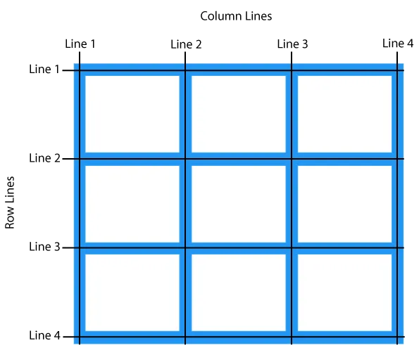
- Grid lines: These are the dividing lines that are created when you define a grid display
- Fractional Units: The
frvalue, otherwise known as the fractional unit, solves the problem of automatically distributing free space among elements and replaces the need for percentages.
CSS Grid Properties #
- grid-template-columns : Specifies the size of the columns, and how many columns in a grid layout.
- grid-template-rows : Specifies the size of the rows in a grid layout.
- gap : A shorthand property for the row-gap and the column-gap properties.
- grid-column-start: Specifies where to start the grid item.
- grid-column-end : Specifies where to end the grid item.
- grid-row-start Specifies where to start the grid item.
- grid-row-end Specifies where to end the grid item.
三、Usage #
<body class="container">
    <div class="item box1"><p>One</p></div>
    <div class="item box2"><p>Two</p></div>
    <div class="item box3"><p>Three</p></div>
</body>.container {
display: grid;
}Position Items by Using a Line Number #
You can refer to an exact line number in a grid by using the properties grid-column-start and grid-column-end.
.tweets   {
  grid-column-start: 1;
  grid-column-end: 2;
  grid-row: 1;
}

.replies  {
  grid-column-start: 2;
  grid-column-end: 3;
  grid-row: 1;
}

.search   {
  grid-column-start: 3;
  grid-column-end: 4;
  grid-row: 1;
}

.messages {
  grid-column-start: 4;
  grid-column-end: 5;
  grid-row: 1;
}
You can also use span (n) where n specifies no. of rows or columns.
grid-template-areas #
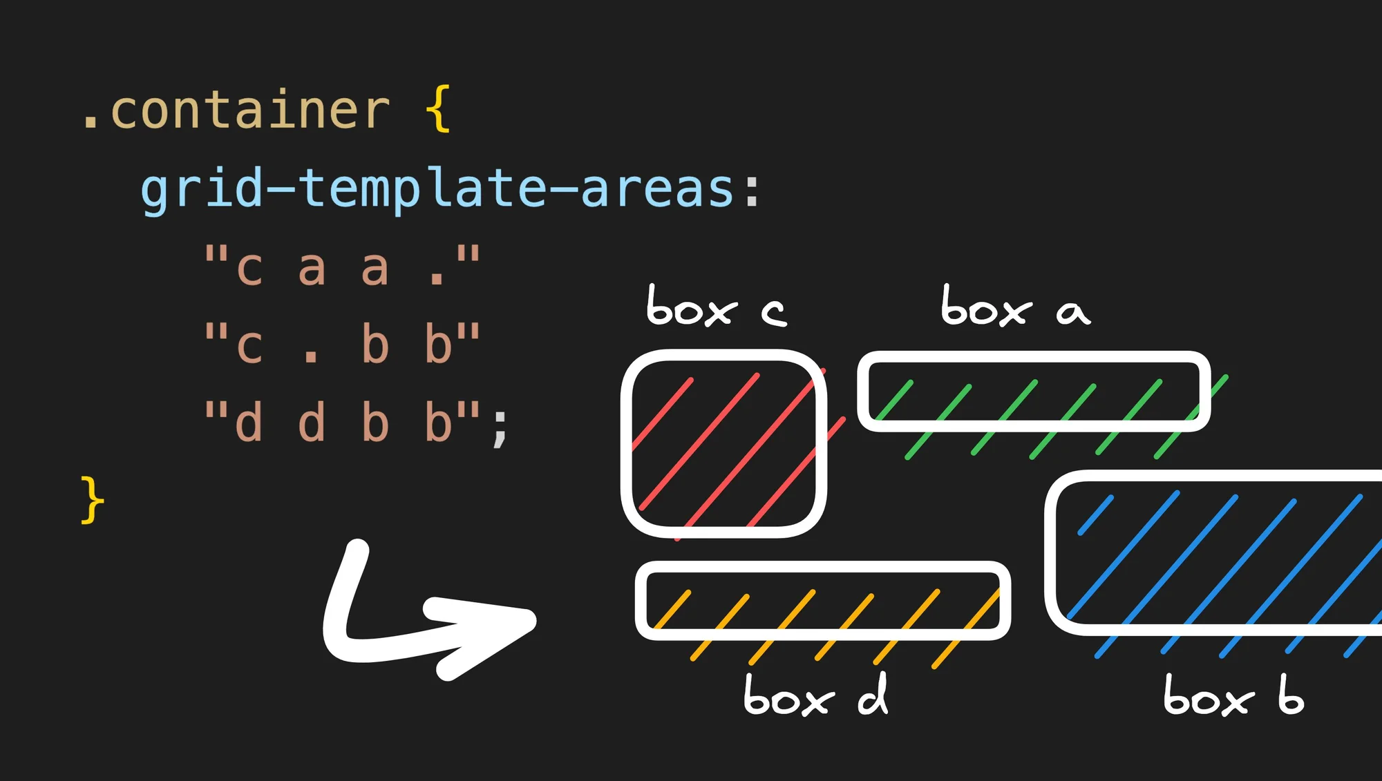
The magical . area
#
Another cool property of grid-template-areas is that you can describe empty cells using a dot. So if you write:
.container {
	grid-template-areas:
	  ". a c"
	  "d . b";
}
There are two important things to keep in mind when using grid-template-areas:
- Each row must have the exact same number of cells (add
.to fill in any blanks). - An element can only stretch into a rectangle. This means that this example:
grid-template-areas:
  "a b b"
  "b b ."
is invalid, because b makes a complex shape that is not a rectangle.
<!DOCTYPE html>
<html lang="en">

<head>
  <meta charset="UTF-8">
  <meta name="viewport" content="width=device-width, initial-scale=1.0">
  <title>Document</title>
  <style>
    body {
      background-color: rgb(30, 30, 34);
      color: #f5f5f5;
      display: flex;
      width: 100%;
      justify-content: center;
      font-size: 24px;
    }

    .container {
      border: 1px solid white;
      padding: 16px;
      width: 600px;
      /* height: 200px; */


      display: grid;
      grid-template-columns: repeat(4, 1fr);
      grid-template-rows: repeat(3, 1fr);
      grid-template-areas:
        "c a a ."
        "c . b b"
        "d d b b";
      gap: 8px;
    }

    .a {
      grid-area: a;
      background-color: #4d7c0f;
    }

    .b {
      grid-area: b;
      background-color: #0e7490;
    }

    .c {
      grid-area: c;
      background-color: #b91c1c;
    }

    .d {
      grid-area: d;
      background-color: #a16207;
    }
  </style>
</head>

<body>
  <div class="container">
    <div class="item a">a</div>
    <div class="item b">b</div>
    <div class="item c">c</div>
    <div class="item d">d</div>
  </div>
</body>

</html>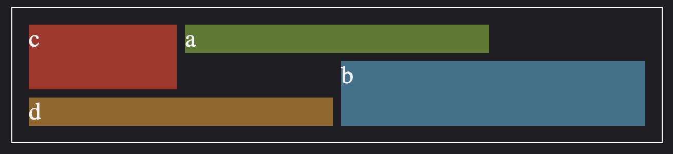
grid-template-columns: repeat(auto-fit, minmax(250px, 1fr));grid-auto-rows: 100px;grid-auto-flow: column dense;